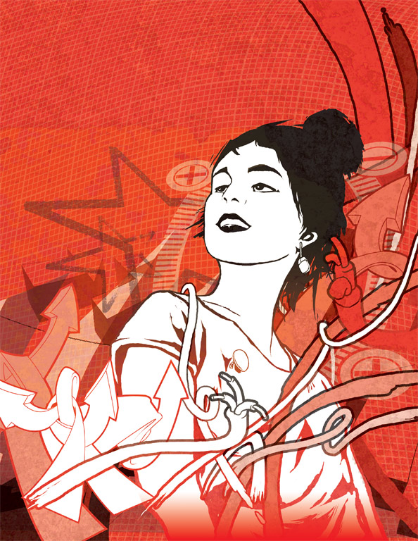
The brief was ‘beating the economic downturn’. Quite early on the decision was made to evoke the power and dynamic of a wartime poster, or a ‘call to arms’. Also, the illustration had to appropriate a much earlier work for the Supersonic festival.

SuperSonic Festival Artwork
I enjoy working with black/white & red since I studied Walter Gropius and his Bauhaus organization at college. There is a great relationship between this particular scheme, being the most regularly used inks the print industry. I also enjoy the fact that you can create RED from the lack of CYAN or BLACK in the full colour process, and RED is a photo-positive hue due to its low frequency.
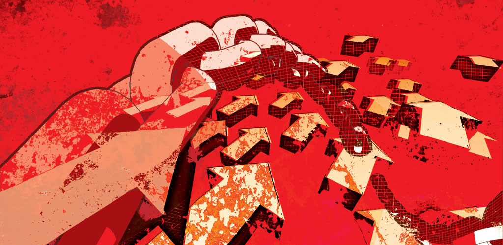
Some other elements were made in Sketchup and then screen grabbed, cleaned up and layered in. There’s also a photograph of the floor of ATS tyre repairs in Aldridge, West Midlands.


