

 painted by Chu and Tek1 in West London 2008")

We were only given a week’s notice for this piece. The whole process of painting was done without any reference at all, no sketches, no photographs. Nothing. I had prepared a sketch for the purpose of communicating the ‘idea’ I came up with to make sure that our client couldn’t ‘be arrested’. It was like this…
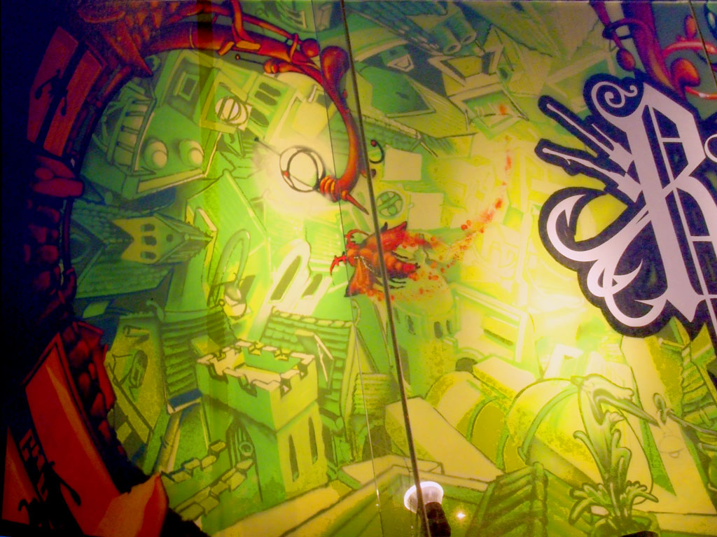
Relentless is a brand new energy drink by Coca-Cola, as part of their launch campaign they asked us to paint inside a JC Decaux showroom in West London. The route it’s overlooks flows from Heathrow and Buck House, 6 lanes of traffic all day long. I almost immediately came up with the concept of a moth, beating itself around a lightbulb all evening, relentlessly (actually it was a memory of an old Max Headroom sketch). The moth would also be performing a kind of airborne parkour above (what i described as) an inverted baroque landscape, within a sphere. Most of the buildings were inspired by my visit along the Cote D’Azur last year.
We (myself and Teck One) decided to keep a symmetry about the whole production, and they had their guideline colourscheme. Their logo was printed onto PVC banner material then fixed on site. Once we had finished the artwork, we then repainted the black edge of their logo with an aerosol finish. Throughout the two days, we saw a coach full of Beefeaters (sitting at least two seats away from each other, not talking) and the French President Nicolas Sarkozy holding hands with Carla Bruni in the back of their car amongst a cavalcade of 20 police bikes and Mercedes minibuses.
The layers were constructed from the pale background first, followed by increasingly darker, closer buildings. The final touches were the extreme foreground layers in black/red colourway to ‘punch it out’ of the background. Their logo also contained the only white elements on the whole billboard, increasing its punchiness. We were painting from 11.30am til 7.00pm on the first day, then 8.30am til 7.00pm on the second and final day. The material that it’s printed on allows backlighting, and due to the nature of ‘cutting back’, the thicker, layered elements would appear darker, even if the final, top colour was white. Because of this, we requested a front floodlit set-up.
A Monorex commissioned project


")
")
