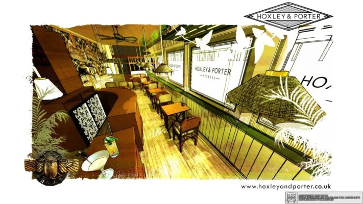
An old friend had recommended me to the guys down at this new venture in north London. They wanted a name, a logo, an interior and an exterior treatment. They also had a few ideas of their own, so I listened to all of them and came up with a lo-fi trompe l’oueil faux-riche crossover… nearly as much a mouthful as in aerosol as i forgot my respirator…
NEVER *cough* AGAIN.
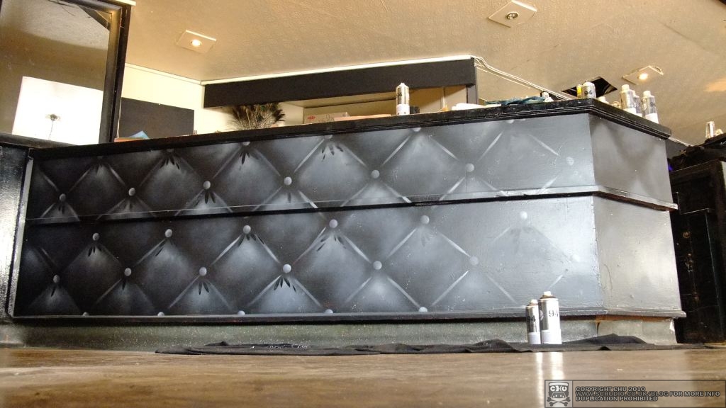
I had began designing from the logo. Monochrome with references to the 40’s/50’s. Mo’ as in ‘more’, tel could be ‘tell’ or ‘hotel’. The pattern became a studded leather cushion effect all around the bar area, this grew out onto the outdoor walls and doors, the logo swingboard got a makeover too.


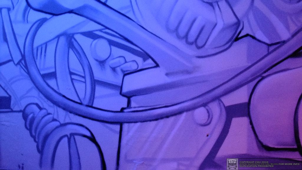
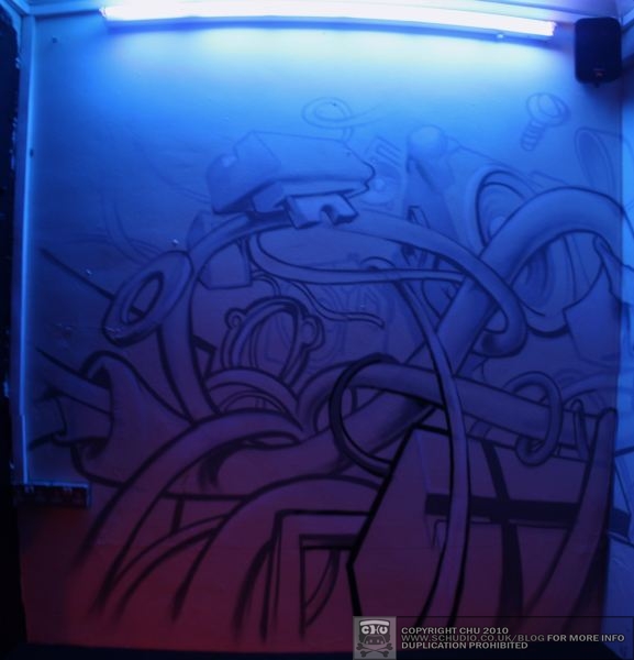
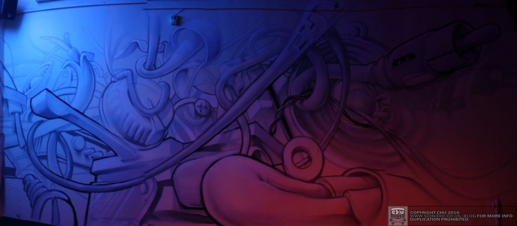
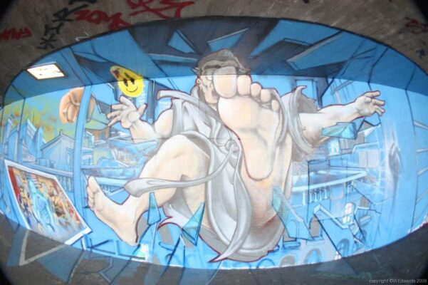
Then we were deciding what to do with this corner seating area on the ground floor. We were going down the stencil wallpaper route, then we were down the big graphic route, then finally I brought their attention to my mutated audio / sound systems. Instantly they liked the sound of it, before they even looked at the Ninjatune XX mural / video. Working with the blue gel on the fluorescent tube, and the fading red coming from the bar area, the white would be awash with colour, moving with peoples’ shadows, the other colours.

