Here’s a selection of some of my favourite logo designs. Really enjoy busting out a logo, one that has legs, appropriate for audience, future-friendly and adheres to guidelines. I’ve got some archived artwork and logo design that I will publish over the next few months.
The following 14 logo designs are spread over multiple pages with a short explanation for each, some shown are variations of the original.
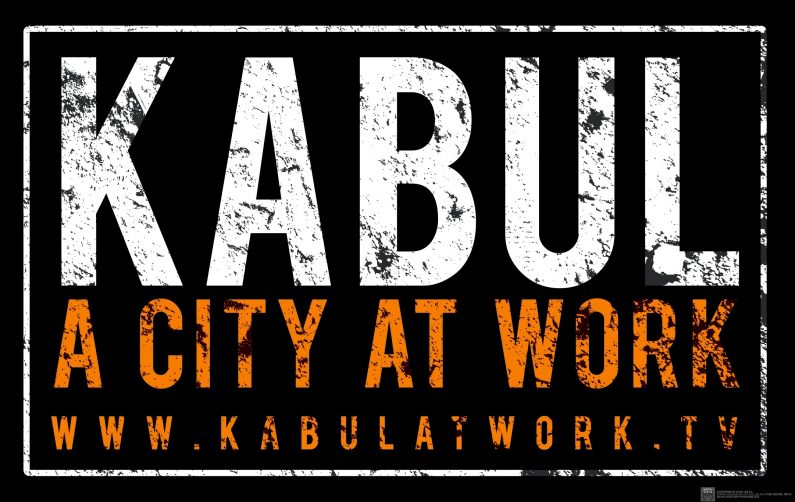
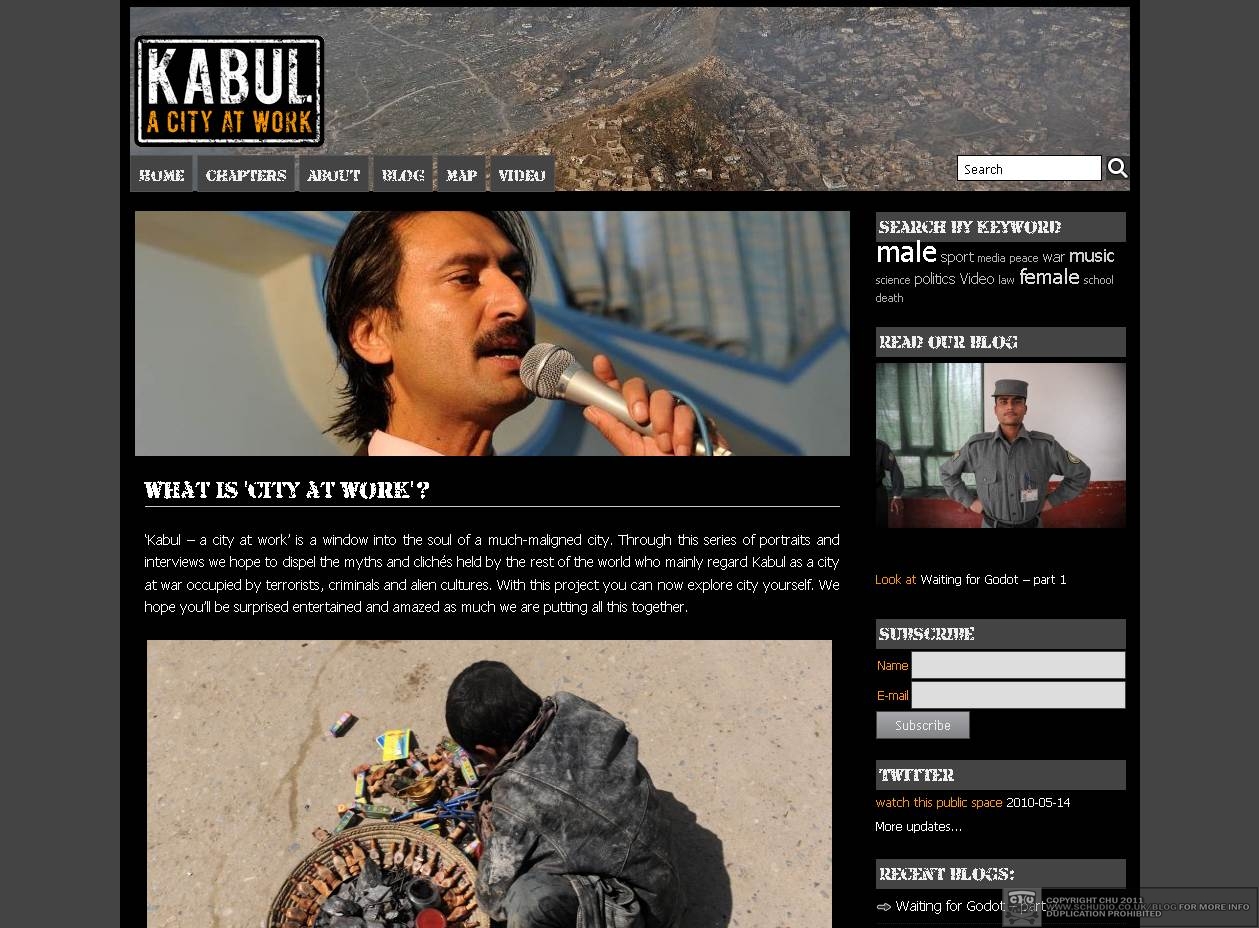
Made for a website that I designed too, this logo represents the feel of this war-torn capital. The site includes interviews with people and some amazing photographs from David Gill, several people who work in the city speak candidly of life in Kabul. I had the idea to make the logo appear like a battered road sign. The dirt texture whch helped degrade the type was actually a photograph of a dirty floor at Glastonbury Festival.
This was re-created to counter the production of the new joy ride that is the ‘Air Line’ over the Thames in the docklands of London. I made it as a sticker design to help ‘promote’ the motorized hanging baskets. This isn’t really an attack of the TFL-backed route, its meant as a comment about the situation that many find themselves in post-olympic London
.

This began life in a freestyle sketchbook afternoon when I got to paint the wall in Shoreditch. It happened to be the same weekend as the first run of the east London line, and the general election. It later got censored during an art prize-giving, made as an art print with edding, picked up as a die-cut sticker and limited edition art print by Souled Out Studios in Thailand, then got created as a £6 tee shirt on THTC. Yes – SIX POUNDS!
If you didn’t realise by now, its an anagram of the gentrified area of east London, called Shoreditch.
Producing a story, a series, is my favourite thing about designing printed flyers. Spread out over a few months, the sequence tells a story, as the logo is supposed to do, even when reproduced on its own. This is one I am most pleased about typographically, for Bobby Friction’s night at Cargo in East London. The flyers will be uploaded in a few weeks, for an archive special. The inspiration (clearly) came from Bollywood film posters, but mainly my own handstyle.
This organisation sets up opportunities for photographers and artists in Afghanistan. They were responsible for taking me out there in 2010. No prizes for guessing the basis for the central CC device.
This was designed for a website that promotes graffiti art and artists in the West Midlands ran by my muckers, ‘400ml Heroes‘. It incorporates the symbol for harmful chemicals found on the safety notice on aerosol paint. The symbol is encased this time in a shield to give the idea of heroic intent.

Designed for my brother’s safety consultancy company Libben.co.uk, I also set up and designed the website in WordPress. The main device is a combination of a letter ‘L’ and ‘B’ (my niece and nephews initials). Their abstraction transforms into a suggestion of a heart within a heart (or a strong arm if you look a certain way). It had to work as an avatar too, for anti-social websites etc.
For one of my favourite festivals of last year, Pridstock was created by a dear friend who decided to hold a three day festival in honour of turning 50 years old. The lovely Arthur Century has a long history of asking me to design flyers and provide artwork for his club promotion in the midlands called Splosh, from 1989ish. I also designed the invitation as his birthday gift too. All of the type is custom drawn. I wanted to make it look like an old album cover crossed with a book sleeve. Think Carpenters (the band) logo and the sixties graphic design duo Stanley Mouse & Alton Kelley.
Quite an honour when I was asked to make this logo (and invitation) for an event for the BBC, in a place I have family connections. This logo commanded a few pages of usage guidelines too. Referenced and celebrated the kingpin of the land, the strength of the metal industry of old, northern England.
Dez TWC taught me about how letters fight with one another, competing for attention, but combining as words into fortresses. This is instinctively how I look at my chisel-tip hand styles when I got a nice half-pounder marker in my hand, uncapped and primed for action. I was kitting out the second show, on Carnaby Street at the time, aswell as hanging pictures, arranging my own artwork and generally just getting in the way. So, we needed two hanging signs for the outside. ‘Where’s the white paint?’ – ‘Can we get some chains?’ – rocked out the marker pen handstyle with (wait for it … *ahem*) a brush. One of the more harrowing aversion therapies I’ve been through.
I created the name and drew the logo for a new venue in east London. It has an apostrophe as a nod to the musical and cultural reference, as found in the jargon of the blues and record labels such as Mo’Wax, and is a shortened form of the word ‘more’. Information about the refit and the other work I did on site can be found here.
Enjoyed making this from the brief; design the logo, create the vinyl adhesives, and attach it to the vehicle for a two-man decoration firm. Awesome. Had it done in two days, even attached the vinyl myself, washed the whole vehicle to get the adhesive attached. Perfect job.
Here’s one valid lesson I learned that day:
Don’t work for Joe Pritchard from Walsall, he doesn’t pay you.
This was an early (unused) design for a book sleeve. I really enjoyed giving it a bit of Barbarella. The book will be published very soon, very exciting for one of my muckers, the author, ex-Creation records dude Chris Abbot. This was my second book sleeve design, previously I created one for Alan Miller’s ‘7 days in a decade’.
Now then, these guys are simply awesome, great to work with. I ended up being their VJ, doing their sound-to-light visuals as they played. One of the weirdest thing we invented for the visuals was a multi-layered lightbox, the ‘oven’. Artwork on acetate was passed on several layers, as required. The vibe with the logo etc. was cooking, kitchens, food. They even used it in the texts accompanying the ensemble.

