
I’m happy to announce the release of my second sleeve design. The result of many months of digital sculpting, research and free-form thinking, then to realise it for output as the whole package. Whilst developing another technique of three-dimensional freehand, I stumbled across a capability to construct organic matter too (humans/animals/plant material). A revelation! I can draw people, and fight as I might – there’s more than one occasion it hasn’t hurt one bit.
Concept
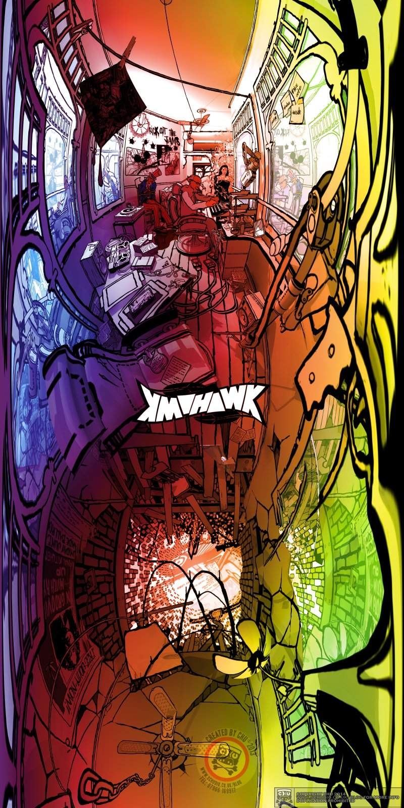
So, there were three words to guide me; Mohawk, John and Sinclair. This began as a replica of Thelonius Monk’s 1968 album sleeve for ‘Underground’. The art direction won a Grammy Award for Best Recording Package the following year, so it obviously ruffled a few feathers. John’s poetry is centred on the very same era and world that Monk would inhabit. I drew visual inspiration from the be-bop culture as a whole, the dress sense, the venues, the backstage stories – as much as I was looking at John’s world too, Detroit-us. My old friend and ally Steve “Fly” Pratt was the producer for the album and gave me invaluable guidance and a third eye into the artwork.
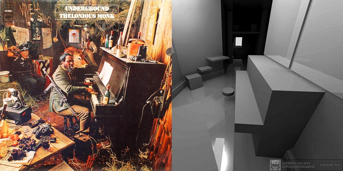
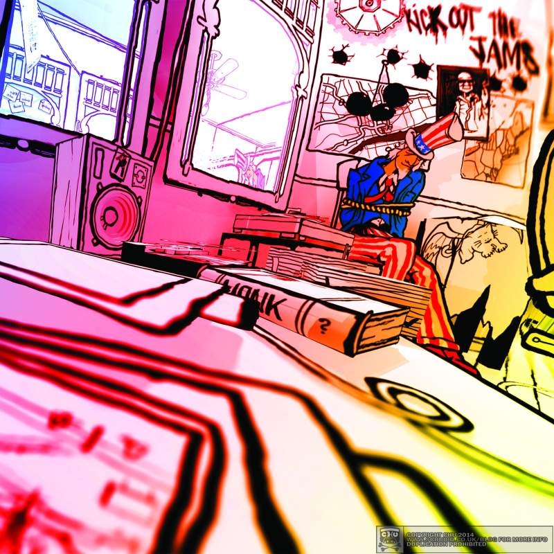
Fortunately, the barber shop scene has similar mechanics to its UK counterpart; the chair, the mirrors, the welcoming luxury, the accessories and the meeting point. The Monk album placed you, the onlooker, slightly above Monk, in a room of some sort. My aim was to replicate the architectural ‘stage’ that was used in the initial Columbia release, and mash it up with corresponding/opposite/realised alternatives:
- Nazi soldier for Uncle Sam
- Piano for a typewriter
- Binoculars for a camera
- Bull for a buffalo
- Straw for Cannabis plants
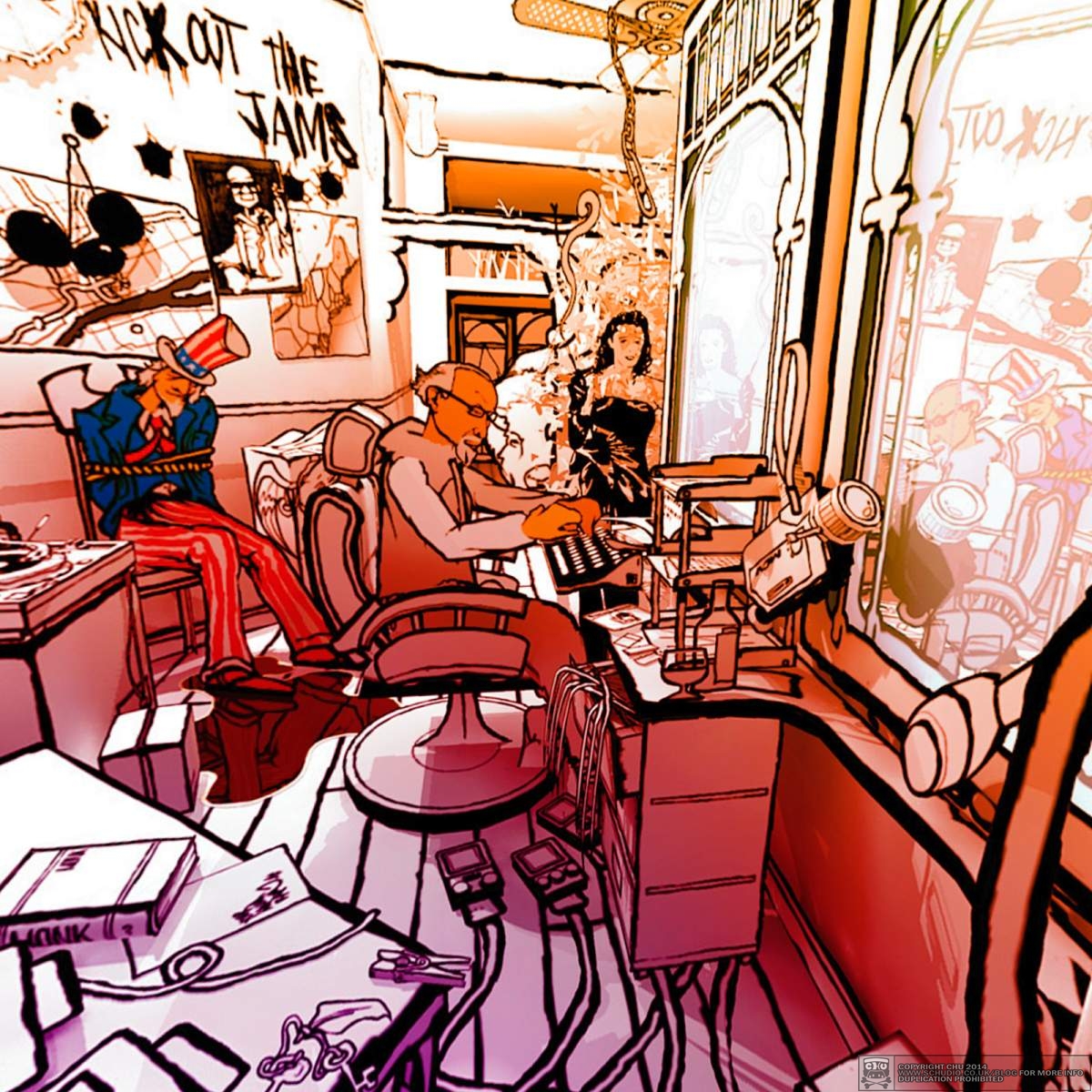
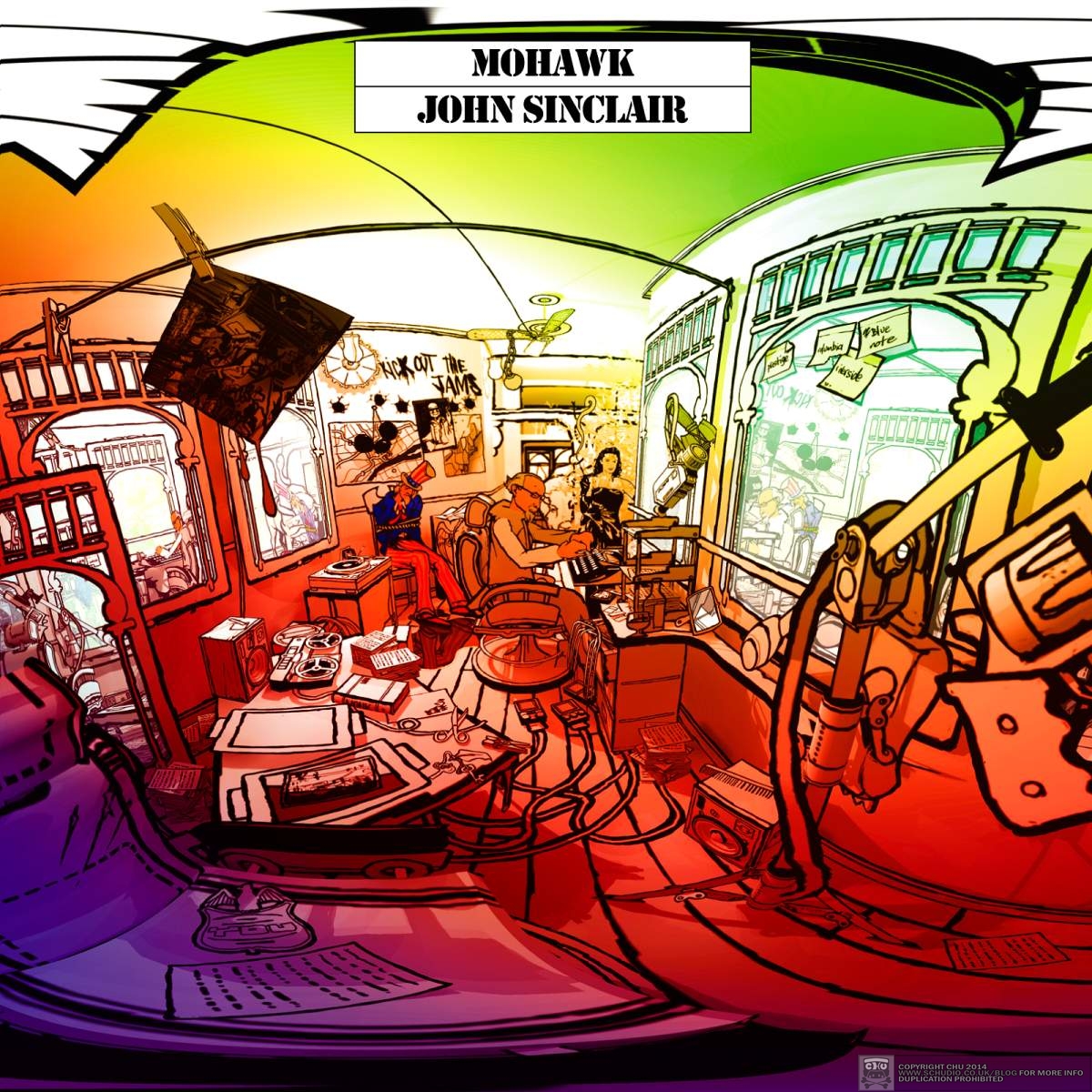
There are references to Detroit, the White Panther Party, Indian tribes, JFK, the MC5 and clearly the sentiment of the time; the saturated, psychedelic wash and the freakishly non-linear, warped angles.
this was watching a different kind of paint dry
I chose to build the artwork as a digital theatre set of this barber shop in Detroit-us, using Google Sketchup. Creating it digitally enabled me to change the viewpoint of the ‘camera’ and/or the lighting without redrawing the entire scene in a different way completely. I could fine-tune the drawings and the set independently, yet watching those two variables collide was familiar territory, but this was watching a different kind of paint dry. This paint would then form the whole graphical asset for the release.
The whole package
I had the sleeve to design, the body of the actual CD, and an additional 12 page booklet (one of the 10 tracks plus front/back cover). You can see the helpfulness and increased efficiency of building a digital stage.
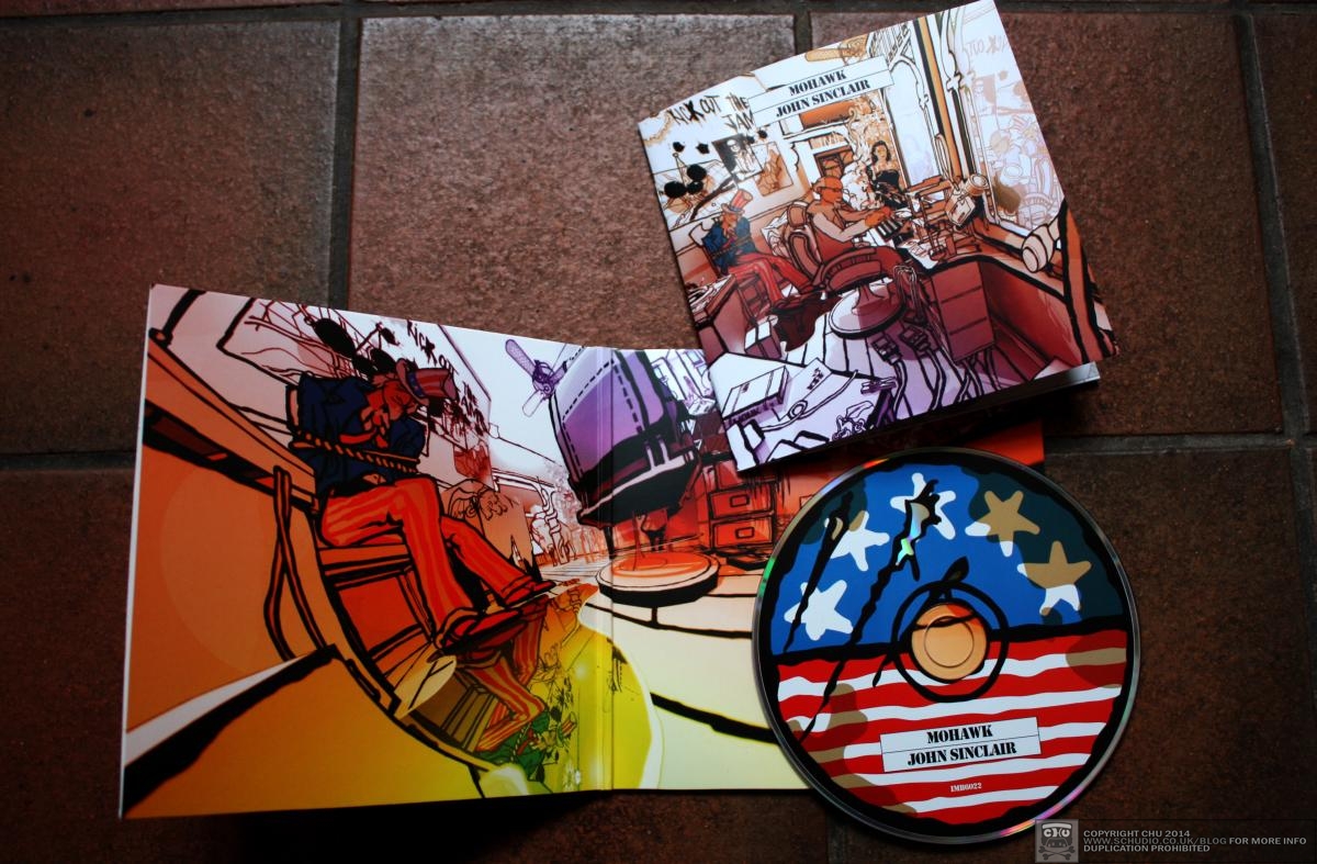
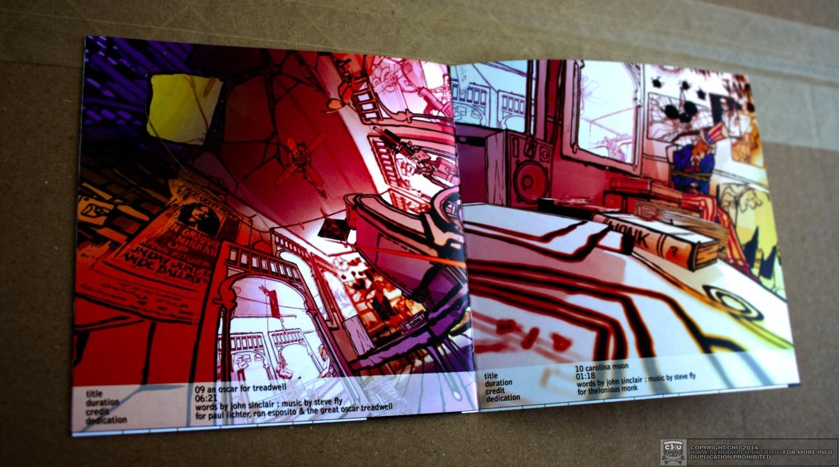

The body print of the CD was meant to make it look like an artefact from Detroit-us, a cartoon-like, simplified, worn, used and stained disc found in Uncle Sam’s pocket perhaps. In certain areas, there isn’t any ink whatsoever, revealing the bare silver. The booklet’s front and back cover are absolute replicas of Monk’s ‘Underground’ covers. Each track has its own page. The playing time versus the track length have a graphical timeline at the footer of each page, assisting the real-world navigation and discovery.

Sleeve Notes
Steve, writing about my contribution: “(Chu is) slicing and dicing the elements at hand to craft a visual universe where the music and words live together”
Here too is the lettering used for the title – an ambigram of ‘Mohawk’, reads the same way upside-down.
How to get your hands on it
This is released on March 24th 2014 on Iron Man Records – further info here.
All press enquiries:
Sean Newsham – sean@mutante-inc.demon.co.uk
Gary Grimshaw (25/2/46 – 13/1/14)
It came as quite a shock to hear of the recent passing of the great Gary Grimshaw. One of the Minister of Art’s posters, for the Free John Now concert is stylised inside the artwork – on a semi-destroyed Detroit-us barber’s wall. I have learned that Gary was such a quite man. He had some of the loudest graphics and technical know-how you’d ever hope to bear witness to. Surprised that his lineage extends to the UK by only two generations. As we approach Gary’s 68th birthday, I remember him and think of how I’m immeasurably indebted.
This one’s for you.
")


