Concept
A very dear friend of mine called Jon, who has known me since I was 17 (that’s 24 years, ahem), has asked me to design an invitation for his 50th birthday celebrations. Now, he’s known to make a good party, loves his motorbikes and he has always been involved with music. When I met him we were on an Apple Mac design course together in Birmingham city centre, he gave me lifts from there back to Walsall and we hit it off big time. He would use my design services for almost every one of his enterprises. He now works for a national company that works a lot with mapping. This invitation was always going to be some engine oil soaked map-like design.
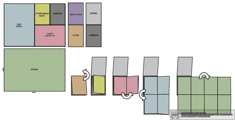
I purchased some original OS maps (one of them was of East London 1974 1:50 000, second series) with most of the Olympic zone still intact, prior to much of its demolition. The OS format was inspirational for the choice of cover colour, which was printed on a thicker card. The map had to fold (and unfold) in sequence to be informative, a bit of fun and still be visible/portable etc..
Sketches
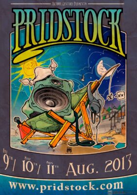
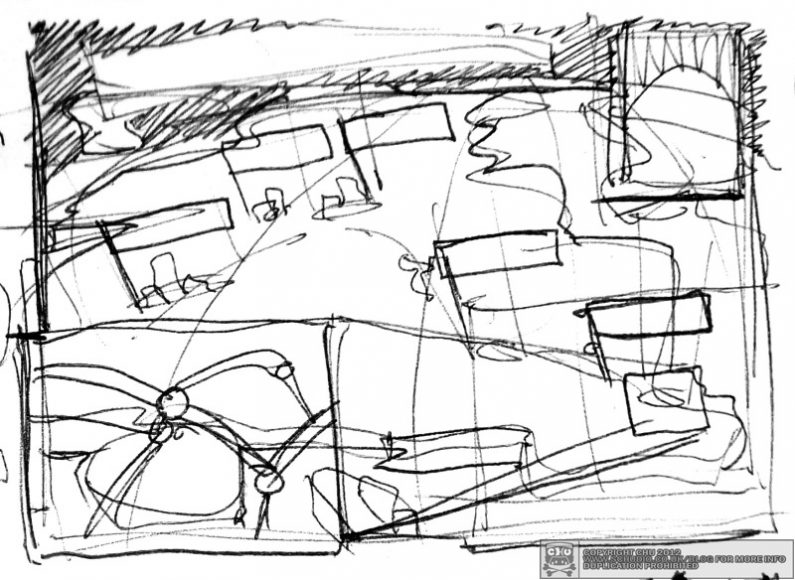
The first idea I started to draw was a paper craft (cut-out-and-fold collectable), but it was proving a bit time consuming, there was no point in making it complicated because the artwork was going to be sent to a lot of people. I busted the next sketch of a Lichfield tent (made in Walsall) with a speaker in the side of it as Jon is a keen bass guitar player, and Pridstock allows you to camp. The guy ropes are cables, and the pegs are jacks going into the ground.
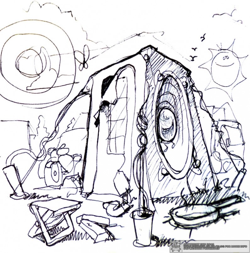
When I scanned the drawing, I decided that keeping the flowing, free-form pen lines was the way to go, Jon even remarked that’s one of my styles that he’s fond of the most. So that was the easy part of the front done, just had to add some colour and complete the remainder.
 Type
Type
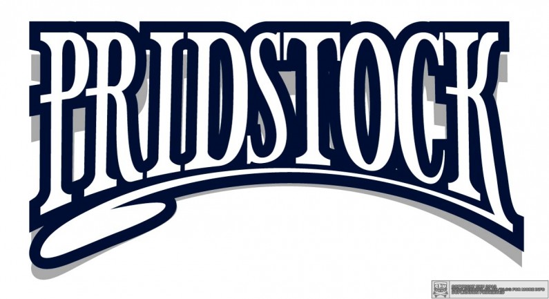
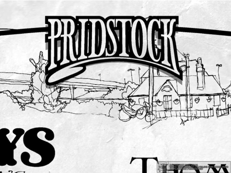
In the tradition of the progressive rock genre, there’s also a corresponding fantasy art scene, one that employs flowing typographic headers and decorative, swirling serifs. The rock scene in general is (graphically) inspired by the psychedelic sixties and several previous art movements, especially when it comes to the type. I really enjoy working typographically.
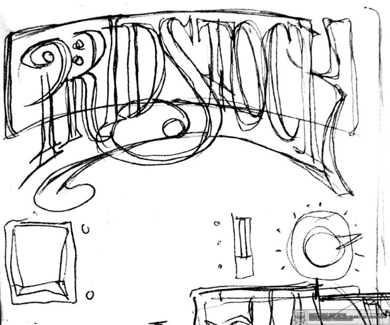
I created all of the vector lettering by hand, from basic building blocks to begin with. For instance, the ‘R’ is a ‘P’ without the kick, and a ‘C’ has part of it similar in foundation to an ‘O’ and even a ‘D’. Unconsciously my final design was inspired by the Carpenters logo.
Map
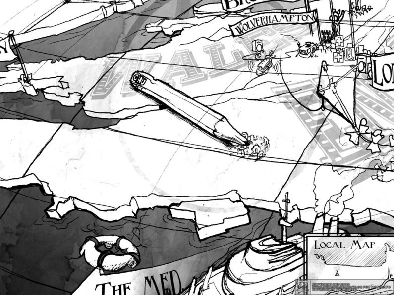
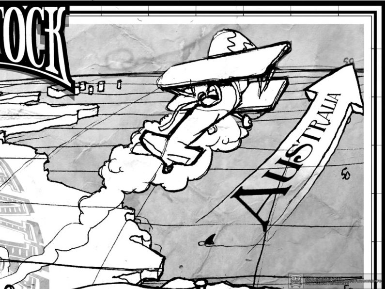
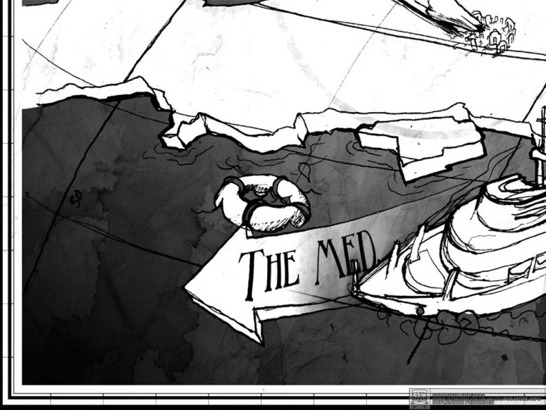
I made the United Kingdom map from 3 different, layered drawings. The first was the grid for the curvature of the earth, followed by the depth contour of the islands and coastline, then one of all the flags for the towns – which unwittingly but beneficially gave it a medieval feel, then topped off with some furniture and landmarks.
Prototype
Didn’t make too much sense doing loads of printing without testing the folding and layout.
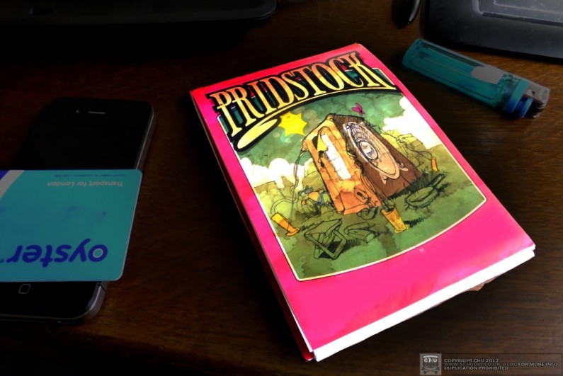
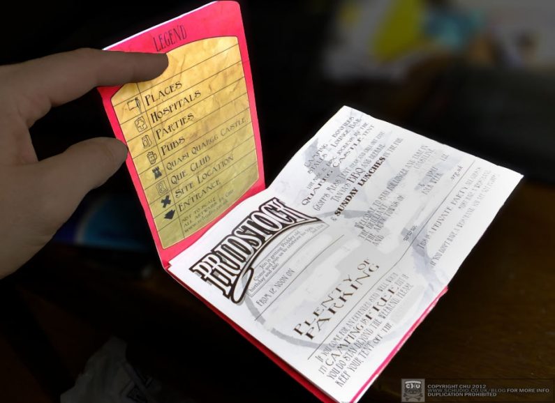
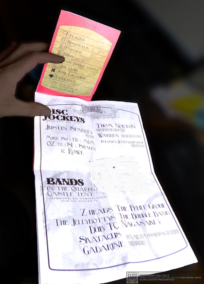
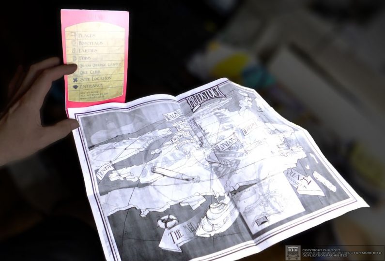
(All of the location and timing details have been removed from the above artwork prior to the event commencing, images will be refreshed after Jon’s birthday in a few weeks)


