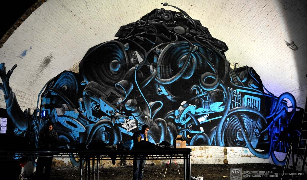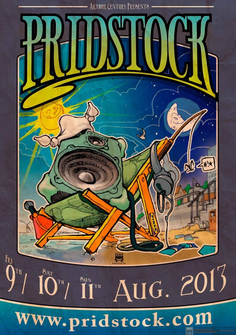
Warmed up my biro for me old mucker’s birthday party again.
I really enjoyed doing last years invitation, complete with wristband etc.. There’s still some people after a copy if you have a spare one hanging around. This year we are keeping things simple(r). I have flexed my site-building skills and produced the Pridstock.com website, to push information out electronically. Last year (the first Pridstock) it was an over-sized, tropical birthday party, with loud music and lots of friends and fires into the night, bands and DJs. Very appropriate for me mate Jon’s 50th. This year some of the promotional hook has took a turn down the super digital highway.
Sketches
I began drawing something a little familiar in this sketchbook – a speaker. Started to remind me of something I was working on for Urban in Ibiza many years ago.
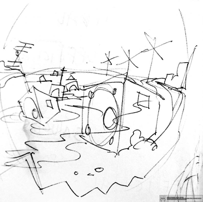
The first line was a little too war-like, something sinister about speakers floating onto the beach, aerials fizzing. It was looking a bit polluted and unnecessary, so I stuck with the concept of beach activity and toned it down a little. Give it a bit of flamboyant Skeggy (sic).
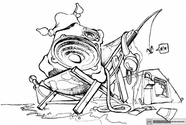
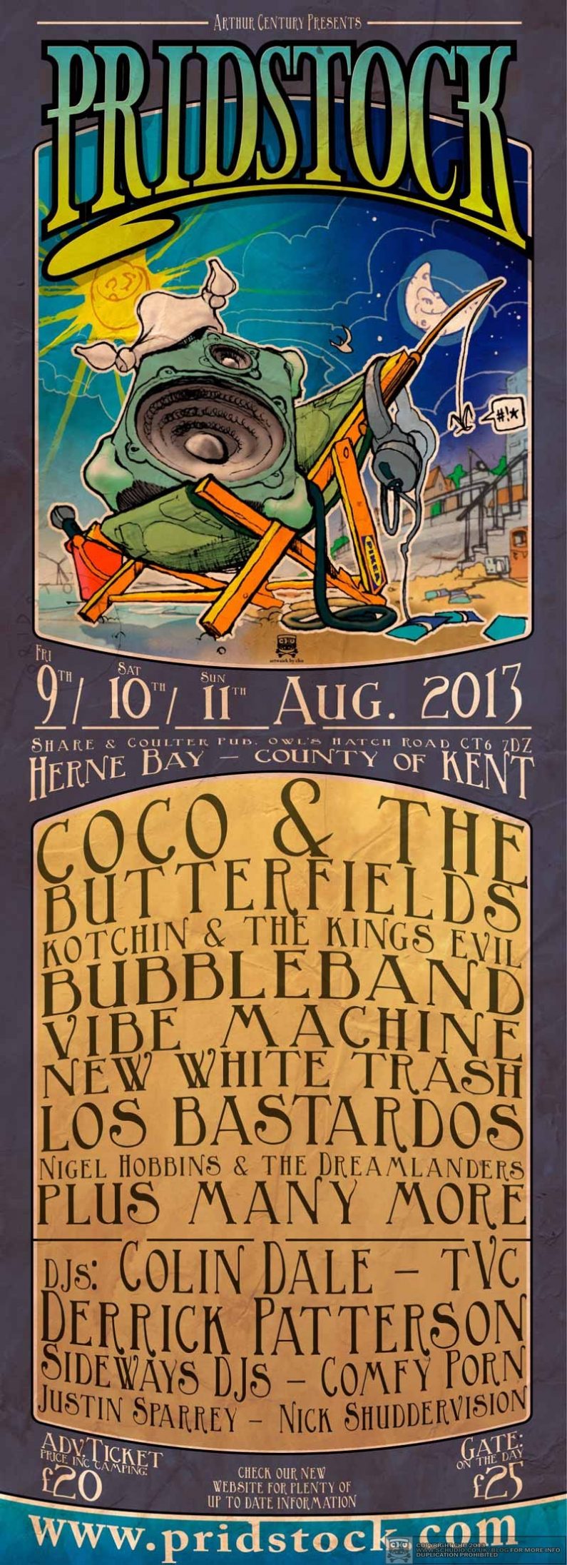
The new speaker was sunbathing in a deckchair with a hanky on his head and a few discarded Oyster cards, just a bit silly, but I was loving the shape of the chair and the headphones. I soon got rid of the tent. I was drawing this in blazing sunshine and last year’s Pridstock was very, very warm. The first week of August is often scorchio.
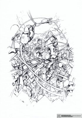
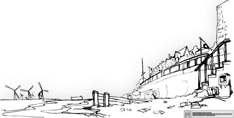
Anyways, I created around 12 layers of biro sketch, first throw-down. It’s easier that way. Computers have a habit of removing things that you can only feel, better to let the ink/paint/hand/eyes do most of the talking. I made a nice little background too, from a real view of Herne Bay as I sat there just over a month ago.
I added some layered cloudscapes and made a rough colour wash replete with shadows. For a while I was considering plugging the headphones into a sandcastle, or the ground or the tent – talk about over-egging the pudding.
Couldn’t resist the Oyster reference…
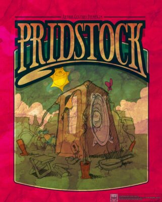
I re-used and then reconfigured some of the artwork from last year. The logo was recoloured and restyled ever so slightly. New, portrait format allowing further decoration to the date & location section just above centre. To emphasise that the festival runs day into night (and again & again) for three days I put one of those clock dials as the sky, links with the local Augustus Barclay Yaffle FYI. There isn’t room to put all the bands’ names and DJs on it, so prominence is handed to the domain name too, kinda ‘oysterised’ on the sea bed.
More details of this year’s line up on the website if you’re interested >
Download Artwork
There are several files to download for free at the new Pridstock website (www.pridstock.com), which I designed from the ground up. Took around 30 days in between things, along with designing the poster. There’s a map and a high resolution version of the poster below. More coming in the next few weeks in the run-up to the actual festival dates.
To view the Pridstock file repository, click the image below.
